Les plaques de rue d'Istanbul
Adrien Zammit - vendredi 13 juillet 2007 - Utilité publique
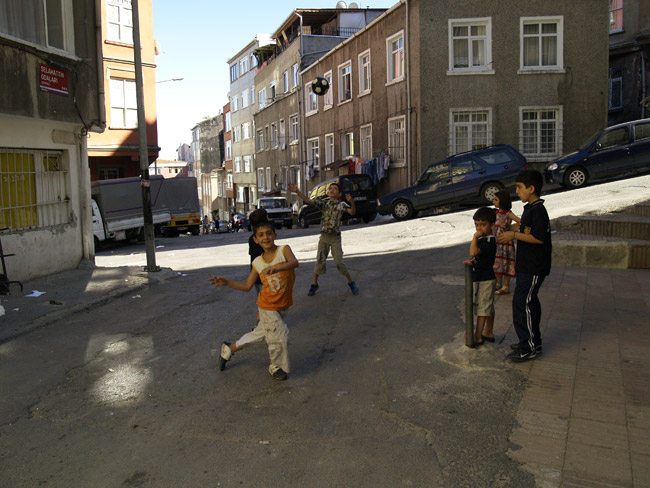
Lors de mon petit voyage à Istanbul j'ai publié une longue suite de photographies de cette ville et de ses habitants et j'ai aussi montré leur signalisation des rues, particulièrement bien pensée pour se retrouver un peu mieux dans cette ville très grande, de plus en plus touristique et très piétonne.
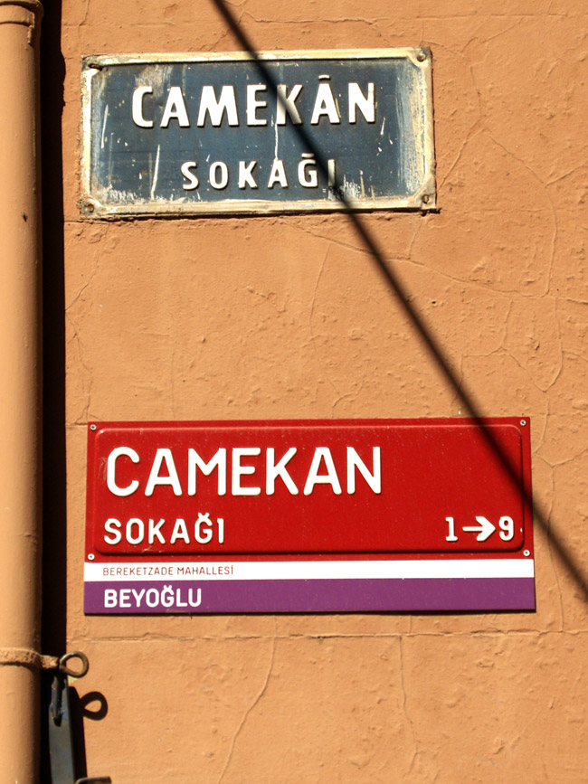
Dans Istanbul les anciennes plaques de rues qui ressemblent aux nôtres sont remplacées par de nouvelles. Celles-ci intègrent des informations supplémentaires assez pratiques, surtout dans une ville labyrinthique : ni un Baron Hausmann, ni une grille américaine n'est venu faire du rangement dans cette très vieille ville d'Istanbul. À noter que le programme de signalétique comporte aussi des petites plaques (également rouges) pour les numéros des maisons et immeubles.
Je vous décrypte la plaque ci-dessus.
Camekan sokagi : le passage Camekan (le passage vitrine?).
1 > 9 : le sens de la rue, dont le premier numéro en partant du panneau sera le 1 et le dernier numéro de la rue sera le 9.
Berrreketzade mahallesi : le nom de la rue sur laquelle on va tomber si on suit Camekan sokagi.
Beyoglu : le nom du quartier dans lequel on se situe.
Trouvée sur le site du Turkish Daily News, une explication complémentaire:
Bülent Erkmen and Aykut Köksal designed the plaques, which are basic communication elements of a city, on the request of Istanbul Metropolitan Municipality (ÝBB). The plaques will soon be seen on all streets and roads of Istanbul.
With this interesting street and road sign system, the plaques will be seen as decorative works. The main purpose of the study is to determine and identify design standards for wall and pole signs of street names and door numbers on buildings in Istanbul's districts. ÝBB aims to develop a strong, standardized design and create communication elements that will play an important role in urban identity.
At the beginning of the project, the designers created a special font, which is exclusive to new street signs in Istanbul.
Aykut Köksal states that Kent' is an unexampled typeface in the world. In designing the typeface, a fantasist' approach, which would hinder the necessary anonymity was avoided, and a differentiating interpretation was adopted. The signs carrying this typeface will have a differentiating specialty that identifies with Istanbul.
When deciding on the color for the plaques, they decided to use red, which is the main background color of all road signs and door numbers. The color of the plaques were red during my childhood as well, and I think there is a special relationship between Istanbul and red, said Köksal.
The second basic level, which carries the district information, is comprised of different colors. The principle used in allocating colors to various districts was based on neighbor relations. Special care was taken not to allocate the same color to bordering districts.
The naming of roads and streets was done according to rules of Turkish grammar. Designers most emphasized the invariable letter size. When one of the words is too long to fit in a line, the letter size does not change, and the word is divided with a small dash in accordance with spelling rules.

